The post-war city centre of Rotterdam is ruled by commerce. Only five percent of the city’s inhabitants live in the centre, which is almost entirely occupied by highstreet fashion chains, fast food restaurants, and offices. After shop closing time, the shutters go down and the streets are deserted. The municipality would like to lure more inhabitants into the centre – but space for new residential buildings is scarce. So in recent years, a 1960s cinema and church had to make way for a huge new housing complex designed by Alsop Architects, and a residential tower by Wiel Arets was speedily attached to Marcel Breuer’s department store, De Bijenkorf. It was not until the municipality suggested forcing new housing high-rises into the green courtyards of the Lijnbaanhoven residential complex, designed in 1954 by Hugh Maaskant, that there were protests and the project had to be cancelled. For the time being, that is.
One densification project, however, tried not to destroy or debase the post-war building originally occupying its site. In many respects, the Karel Doorman residential high-rise could even be called the saviour of the old Ter Meulen department store. It might be rather uncommon for a valiant hero to crouch down on the shoulders of the little old lady he intends to rescue – but that’s more or less what happened here.
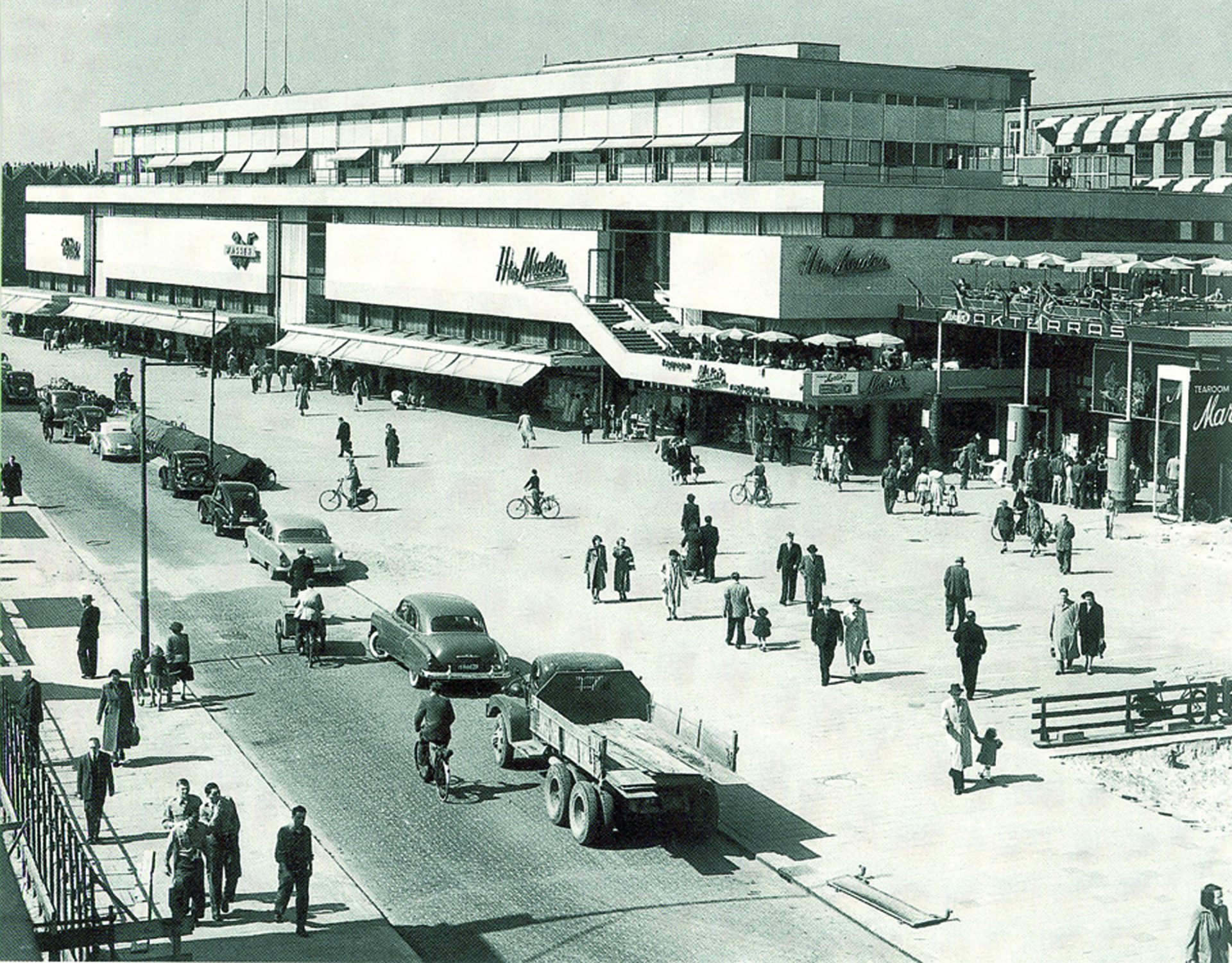
In 2001, architects Ibelings van Tilburg were approached by the owner with the question what to do with the old Ter Meulen building. Built between 1948 and 1951 by legendary Rotterdam architects Van den Broek en Bakema, the shopping centre was in a sorry state. Originally occupied by three department stores, the 100-metre-long building had become home to a host of slightly trashy shops. It had undergone various transformations, including the addition of two storeys in 1977 and the removal of a distinctive café terrace, which used to jut from one corner of the volume at an angle. Only experts could still detect its architectural merits. Things didn’t look good. Surprisingly, though, the architects came up with the suggestion to restore the shopping centre to its original state – and place a residential building on top of it to make it economically viable.
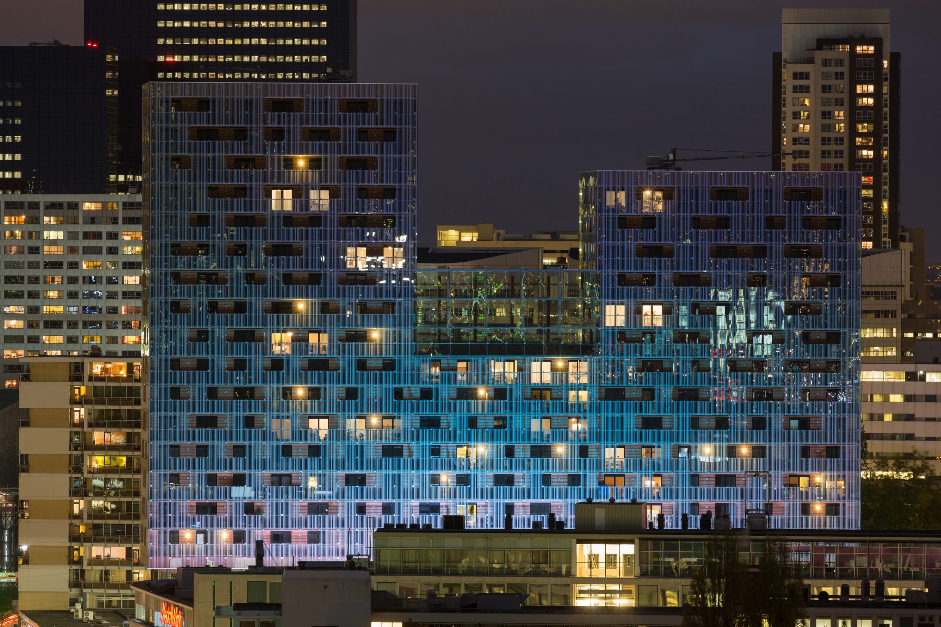
The new building houses 114 apartments on 16 floors and rests on the columns and foundations of the existing structure. As it turned out, the strength of the load-bearing structure of the post-war shopping centre had been rather overcalculated and could carry far more weight than just its own three storeys. In the original design, stability was achieved through a portal system with columns and beams. For the extension the construction team added two new concrete stabilizing cores, which pierce through the old building, stand on their own foundations, and contain the staircases and elevators. Nevertheless, its height of 16 storeys was quite ambitious and meant that the addition couldn’t weigh more than 250 kilograms per square meter. This ruled out the standard Dutch construction system with concrete floors and walls, which weighs up to 1200 kilograms per square meter. Instead, the main load-bearing structure was made of steel with wooden floors. In order to avoid acoustic problems, a box-in-box construction was used for the apartments.
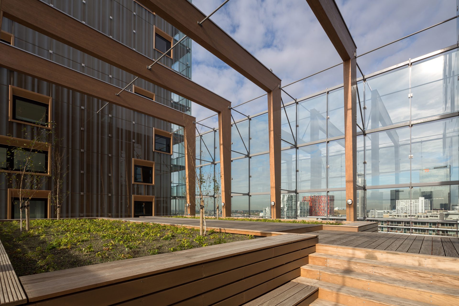
On top of the old building are two parking levels, accessible with the help of three car lifts. The new building stands on pilotis and seems to hover several metres above the shopping centre – which results not only in a visual separation of old and new, but also reduces wind forces on the pedestrian level. Between the two towers of the extension (one counting 13 storeys, the other 16) lies a communal roof garden on the seventh floor. The building is covered in a “raincoat” of glass with a curtain-like print, and the façades behind the glass walls are clad with pine wood. The openings in the curtain, behind which are loggias, look like they’re round-edged, but that’s just an optical effect, created by the quatrefoil-shape of the point-fixing elements that hold the glass panes.
The exterior of the shopping centre has been carefully restored. However, the café terrace hasn’t come back, and – what’s worse – the fashion chains have closed up the large window panes with advertisements and logos, destroying its intended aesthetics. While in old photos the building looks like an elegant, loose composition of separate cubes, stacked and pushed together, it has now become a solid block. That’s infinitely better than what it looked like fifteen years ago, but it’s only halfway back to its former glory. Of course the question is also whether the huge new high-rise, with its high-tech corporate-style glass façade, is really such a noble saviour. Maybe it’s just a giant parasite, which has grown fat by feeding on its host? At any rate it has prevented the Ter Meulen building from going the way of many other out-of-fashion retail structures and unloved post-war buildings in the centre of Rotterdam.
This article was first published by our friends over at Uncube.


