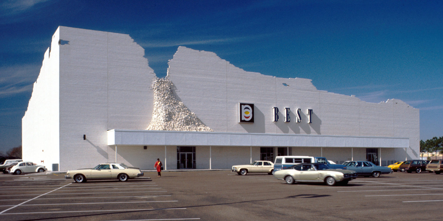
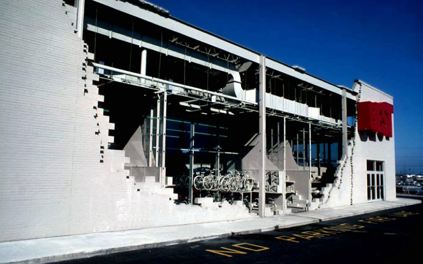
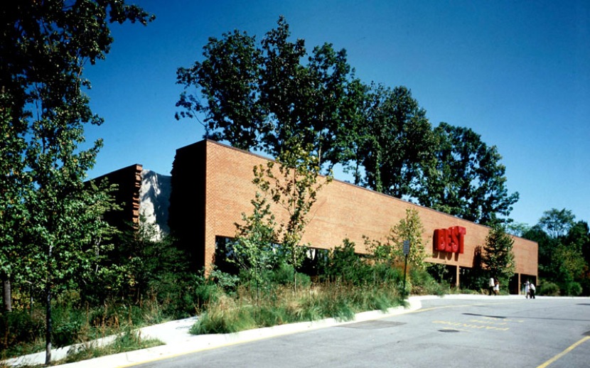
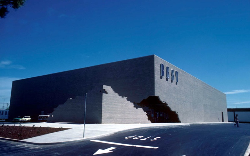
In the mid 1970s, the Lewis Family (the owners and operators of catalogue company BEST Products) hired Sculpture In The Environment (SITE) to create a series of facades for nine showrooms across the US. Regardless of the project’s relative financial benefits, the clients gave SITE the one thing all designers crave and fear: full creative reign.
Thus begat the BEST Products Showrooms, an incredible series of architectural commentaries on consumerism that were so in tune with material culture they can easily be simplified as the apex of American Postmodernism. Intrinsically, opinions on whether or not the stores were even “good” range wildly depending on the audience and the speaker, even now, 40 years on.
The showrooms are still either praised as meaningful societal criticism or vilified for ignoring a humanist discourse in favor of rhetorical games. Each camp will find its own heroes: acolytes of Robert Venturi on one side, and Team Diane Ghirardo on the other. Yet the question remains: whatever happened to the stores? That is, the actual structures? Whatever happened to Baby James?
The Unusual Suspects
As far as architectural partnerships go, James Wines and The Lewises were made for each other. Sydney Lewis founded BEST in 1958 and it soon became a successful supplier of cheap home goods, camping equipment, jewelry, toys and electronics. As years went on, Sydney needed to take up a hobby for his health, he chose Art. His wife Frances inspired this interest and soon the rest of the family followed suit. Almost simultaneously SITE was making a business out of pithy, fearless snark. Knowingly led by a fledgling graphic designer and sculptor with street cred to match his academic precociousness. The stars of kitsch and contentiousness were set to collide.
Both Lewis’ stores and Wines artistry were very much products of the post-war economic boom. The plastic-fantastic, unironic and homogeneous optimism that set the stage for the inevitable disillusionment which followed. These two men had been encouraged to imagine infinitely bright futures, only to have the doors slammed upon reaching inheritable age. As a result they knew opportunity is a limited commodity and to always get in while the getting is good.
Though it would be too easy to say that the pair were slaves to consumptionism. The partnership was more than that. It was about the jokes, sure, but both designer and client knew the work would be wrongfully seen as a pure capitalist gimmick and tried to fight against it. In a 1981 TV documentary, the then President of BEST, Andrew Lewis (Sydney and Frances’ son) stated: “If [The Showrooms] were an easy sales gimmick, a lot of people would be doing it. There’s a lot of risk in it and there’s a lot of less risky ways of promoting sales.”
And to his credit, who were these structural marvels really going to impress? Were artists and architects going to flock in droves? No, the Showrooms were for people already shopping at BEST, not for the architectural and artistic communities who would either sneer or cheer them. It was a community arts project at its least condescending. This was Street Art before Street Art was a thing. While the stores may not have been intended as a gimmick, the Lewises were right to see them as a risk. A year after the documentary was produced, a New York Times article stated that profits had fallen 13% since the comparable quarter in 1981.
Instead of a gimmick, it’s best to see the storefronts as a re-branding. By aligning themselves with the artistic avant garde, BEST would become more than a box from which you get junk. They would become the Anti-Walmart, using specificity to generate localised brand loyalty. As a faceless commenter in the 1981 documentary spouts: “[The Architecture] sure does take the squareness out of buildings.”
The BEST stores survived on a combination of this localised charm and a drastically reduced kind of automation for a few more years. By 1983, they had implemented automated conveyor systems and point-to-order technologies to eliminate the cost of human labor. Regardless, the end was near. BEST had withstood thirty years of highs and lows, but what it could not withstand were the unwieldy behemoths of EBay and Amazon.
CASH 4 GOLD
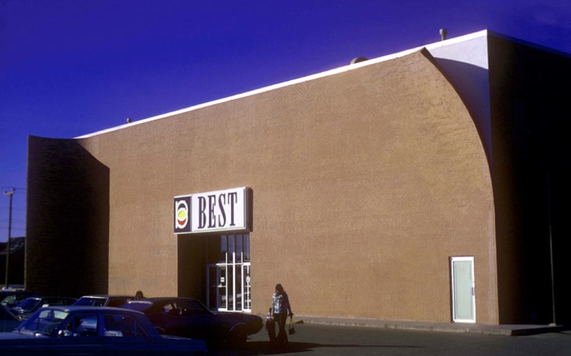
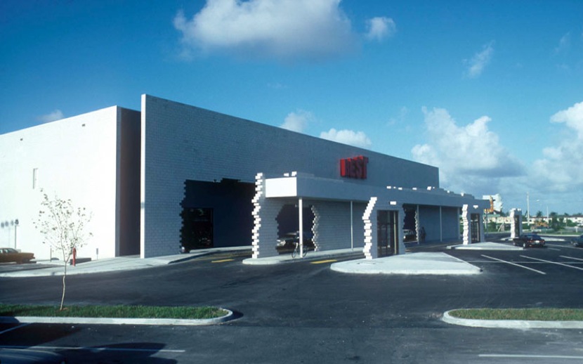
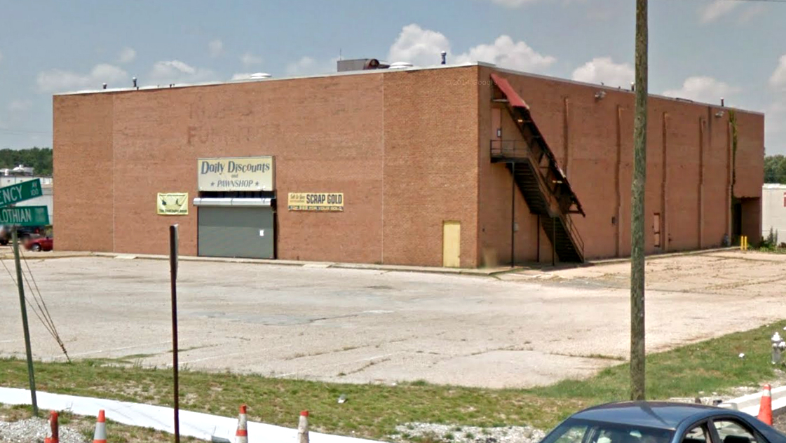
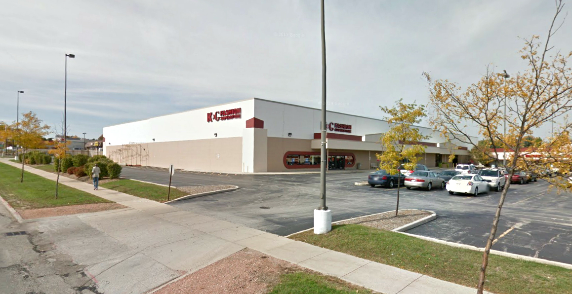
After BEST’s liquidation in 1997, each of the Wines masterpieces fell into disrepair within quick succession. The Peeling Project lost its curved wall to a pawnshop, leaving only a mark on the concrete. The Notch Project had its marvelous revealing entrance converted to a Best Buy extension. The other facades in Milwaukee and Ashland were removed when the buildings changed ownership. The Cutler Ridge Project was completely demolished. The Water Project in Hialeah, Florida was dismantled as well in the late 90s since the maintenance costs of a living facade were simply too great. However, the new owners did keep the planters which are apparently still in use.
The most dramatic downfall was the The Tilt Building 3 which was razed completely in 1997 to make way for a new (and standard) big-box shopping center. At the time, the new work was estimated at $20 million and despite its impressive price tag, the entire complex is completely, frustratingly innocuous. Wines lamented the loss with the painfully American statement of: “In France, this would never happen.”
Wines, it should be noted, was a graduate of Towson High School, just a few minutes drive away from the Tilt building which must have made the collapse more poignant. The local boy made good and nobody cared. Though if it were any consolation, no less than legendary filmmaker, Baltimore native and pencil-mustache aficionado John Waters offered an articulate condolence: “It figures anything with originality, they would tear it down.”
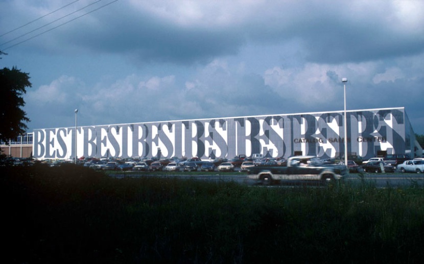
By 2001, the two remaining examples were the Indeterminate Façade and the Forest Showroom. They were due to have separate fates. These last remnants of the old guard were the subject of a Metropolis article from 2003, which included some affective thoughts from Rice University lecturer, Stephen Fox: “The building’s preservation has depended on its function as a big-box store.. There’s not much sentiment here for preserving suburban landmarks.”
The position proved to be prophetic. In a few short years (and after a brief stint as a furniture liquidation center) the crumbling white bricks of the Indeterminate Facade were removed, leaving the remaining frame without interest or commentary. Thankfully the Forest Showroom, the last remaining survivor of an experimental lineage, had found a benefactor in the West End Presbyterian Church. Almost 14 years later, they still hold services. So why wasn’t there a stronger attempt to save these pieces when there was still a chance? For this we need to look at questions of typology and popularity, print and built.
Just Keep Chasing Pavements
Stephen Fox’s assessment that the Best Showrooms would only survive is if they remained functional as consumerist architecture made sense at the time. After all, the Big Box store had gone unchallenged as a suburban character for over 50 years. Though with the perspective of another ten long years, a massive global recession and the continued expansion of online shopping, it seems the reason for these buildings’ extinction is more complex than that. Especially given that the only surviving member is not a Big Box store at all, but a church.
The typology of the Big Box store is familiar to any architecture student as the knee jerk embodiment of soulless merchandising against a flat landscape. As architectural thought and rhetoric grows increasingly urban (and with good reason, as most people now live in cities) these kinds of buildings represent everything backward and wrong to young, endearing designers. Big Box stores aren’t “authentic” and therefore worthy of contempt and irony. However authenticity is a quality that is most appealing to the privileged. Looking down not only on the architecture, but also to its users. It is a conveniently self-righteous position for people who have the choice not to use such places. Big Box stores may never have been glamorous but they were practical and, for a while, extremely successful. Yet now as the mightiest middle-class retailers are digital, criticism of Big Box stores just seems too easy. Like shooting minimum-wage fish in an economically constrained barrel.
What made the BEST Showrooms so successful as architectural statements was the balance of spite and sincerity. SITE at the time had all the swagger and irony, but without contempt for the users or client. Going by the old Mel Brooks dogma of really loving the object of your mockery. Further, the BEST Stores died not because its users didn’t care, but because the Big Box store, or at least a version of it (the version which could survive on inconsistent stocking) was obsolete.
Still even if the buildings aren’t around anymore, does that mean they’re dead? Any image search shows the structures in their full, if static, glory. In a way they have reached that untouchable perfection of the Crystal Palace, Old Madison Square or The Hanging Gardens of Babylon. In record time no less. The BEST Showrooms are now impervious to a certain kind of criticism. The loss means they exist as what they were ever going to be: ideas. And these kinds of ideas, such as they are, can only exist in the ether, never loving anything fully and never being fully loved in return, except as an typology, or perhaps archaeology. Authentic in their inauthenticity.
